

We are surrounded by words; in books, in advertising, and on the computer. Styles of lettering, whether hand-written, printed, or computer-generated work on a conscious and subconscious level, and much thought is given in design into using lettering that is aesthetically pleasing and also conveys the message intended. Many of the common fonts we see every day are derived from older forms of type. For example, Times New Roman is a familiar font widely used on websites, in books and newspapers and on official documents. It is clear, attractive, and on a subconscious level conveys a sense of seriousness and credibility. It was created in 1931, and was used for many years in the London newspaper The Times. It was inspired by older fonts with origins in the sixteenth to eighteenth centuries.

Comic Sans MS is a modern font which was inspired by comic book lettering. It is a casual font, and was intended to be used for informal documents. Its use has sparked controversy, which is described by Wikipedia as follows (source): "Installed on the majority of computers worldwide, Comic Sans sees
widespread use. Within four years of its release on Windows, designers
had begun to argue that it had become overused, often through use in
serious and formal documents in which it could appear too informal or
even as inappropriate and disrespectful. Examples of uses to which it has been considered poorly suited have
been a Dutch war memorial, printed advice for rape victims, blog posts
by a law firm and as a font recommended for résumés in careers training." People may not take information printed in this font seriously, as described in the same Wikipedia article: "Film producer and New York Times essayist Errol Morris
wrote in an August 2012 posting, 'The conscious awareness of Comic Sans
promotes — at least among some people — contempt and summary
dismissal.' With the help of a professor, he conducted an online
experiment and found that Comic Sans, in comparison with five other
fonts (Baskerville, Helvetica, Georgia, Trebuchet MS, and Computer Modern), makes readers slightly less likely to believe that a statement they are reading is true."

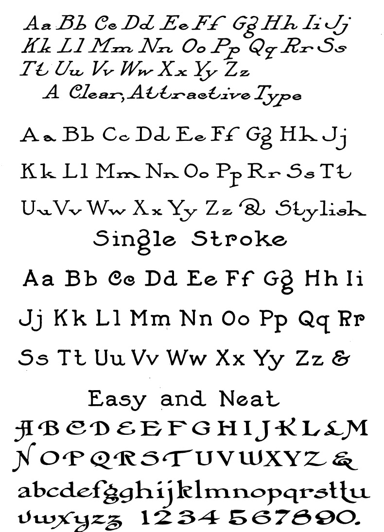
In past centuries, it was important to choose appropriate and attractive lettering for use in art, design and advertising. Much lettering was done by hand, and there are many beautiful examples available of the alphabets which were used in the 19th and early 20th Centuries. People were always looking for something new and interesting to make their work stand out, and numerous books were printed which showed examples of different alphabets, which could be adapted for different purposes.
The following examples of alphabets are taken from Draughtsman's Alphabets by
Hermann Esser (1877). Some of these alphabets are printed on grids, to
assist the reader in learning how to reproduce the letters.


The following examples are reproduced from One Hundred Alphabets For the Show Card (1913), which featured alphabets specifically designed for advertising. These were originally printed in the journal Merchants Record and Show Window, which, according to the editor, "should be read regularly by every card writer and window dresser."


Womens' magazines of the 19th Century often featured beautiful sample needlework alphabets, initials, and even names which could be used for monogramming linens and clothing. Other alphabets could be used for filet crochet and beading designs. The following intricate letters appeared in Godey's Lady's Book and Magazine in 1859.
 |
| Initials From From Godey's, April 1859 |
 | |
| Names For Marking From Godey's, February 1859 |
 |
| Crochet Alphabet From Godey's, August 1859 |

 |
| Variety Alphabet For marking Pillowcases, etc. From Godey's, Oct. and Nov. 1859 |
No comments:
Post a Comment